Linus & Huckleberry by Robert Neubecker

Best letter ever:

Hello Robert,

My name is Kirsten and I just wanted to write you an email to tell you how much my baby boy, Huckleberry, loves Linus. My husband recently bought some children’s books on a vegan/vegetarian theme, because that is what our family is, and Linus is our absolute favorite! Huckleberry will be turning 1 year old on the 5th of August, so very very soon. He can only say Mamama (though I’m not sure he understands that is my title), and he just learned how to wave a couple days ago. Now, each time I come to the part where Ruth Ann says goodbye to Linus, Huckleberry waves when I read the word “goodbye.” It is so sweet, I nearly started to cry tonight. It’s just the first time I’ve seen him draw a connection like that, so it feels really special. Thank you for bringing joy to our story time! Linus is indeed a very popular dinosaur at our place!

Cheers!

Kirsten

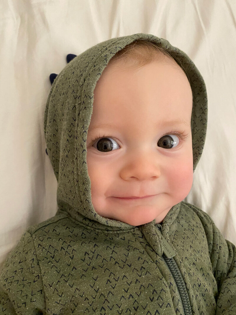
Ps. Here’s a photo of Hucklesaurus from a little while ago, when he still fit his dinosaur romper.

HuckleberrySS.jpg

Gifs! by Robert Neubecker

Emily, my excellent intern and I have been working on new gifs. We’ll be making more out of old drawings, and new as they come up…

Here’s the more complex one. Simple below. Kinda like the simple better- like Godzilla vs. Bambi..

Here’s the more complex one. Simple below. Kinda like the simple better- like Godzilla vs. Bambi..

One of my all time favorites: Spending your 401K early for the NYTimes.

One of my all time favorites: Spending your 401K early for the NYTimes.

NyTimes- unused sketch for cyber privacy- American Illustration award & annual 2019

NyTimes- unused sketch for cyber privacy- American Illustration award & annual 2019

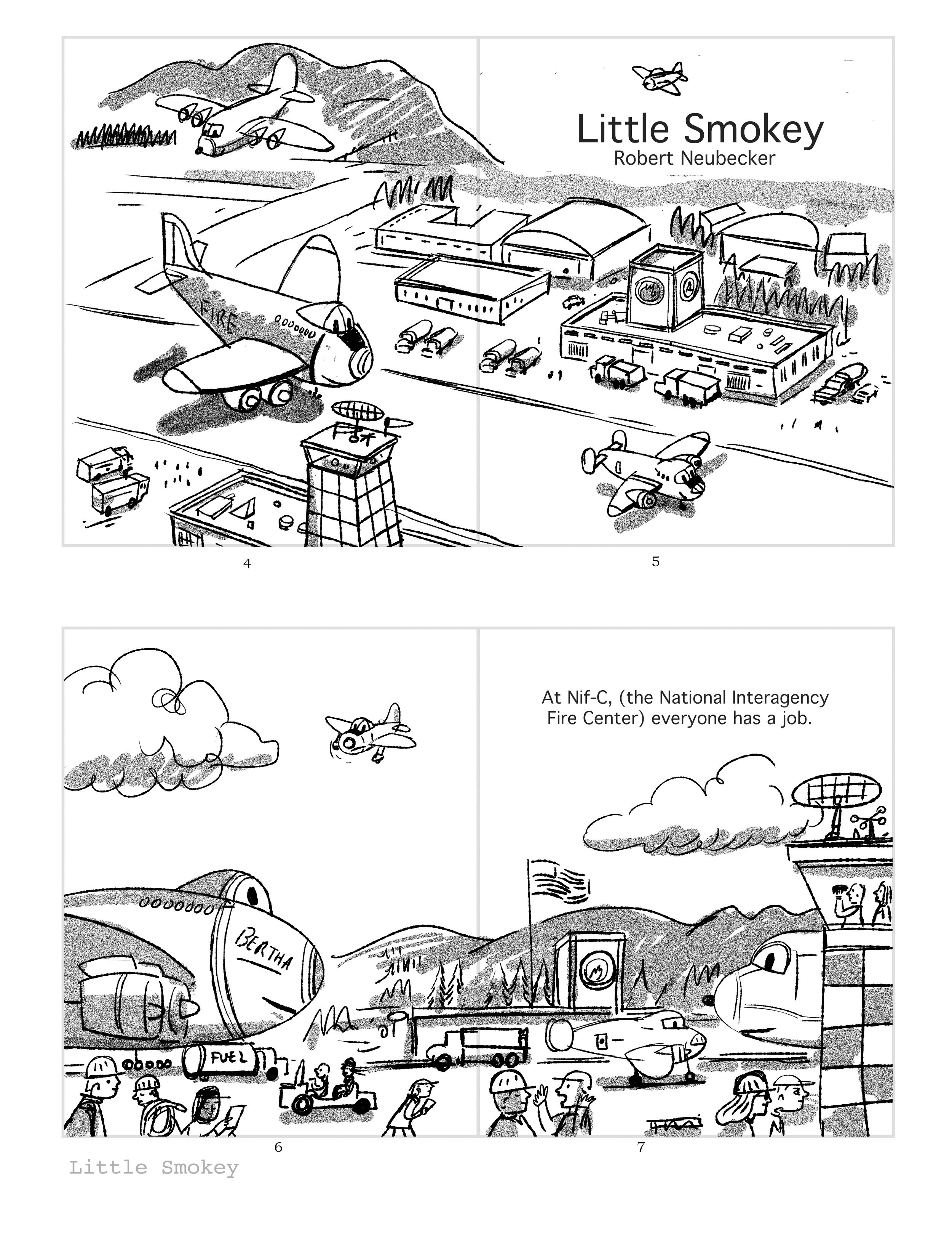
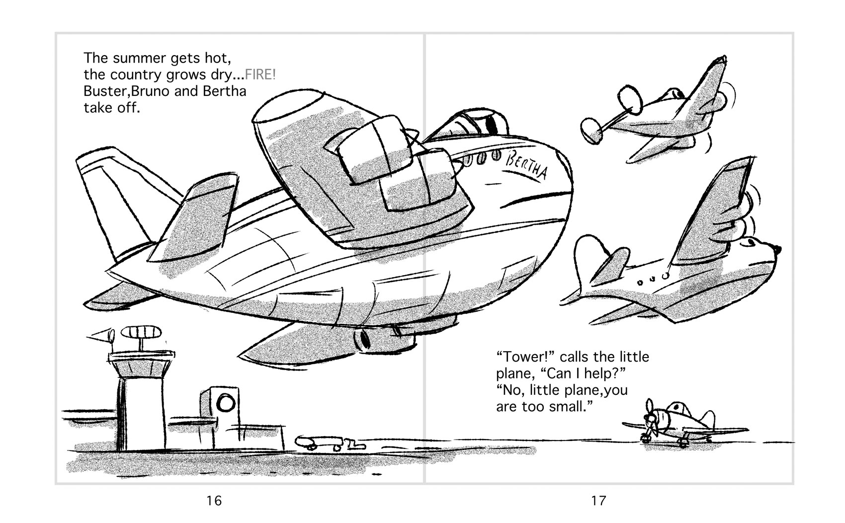
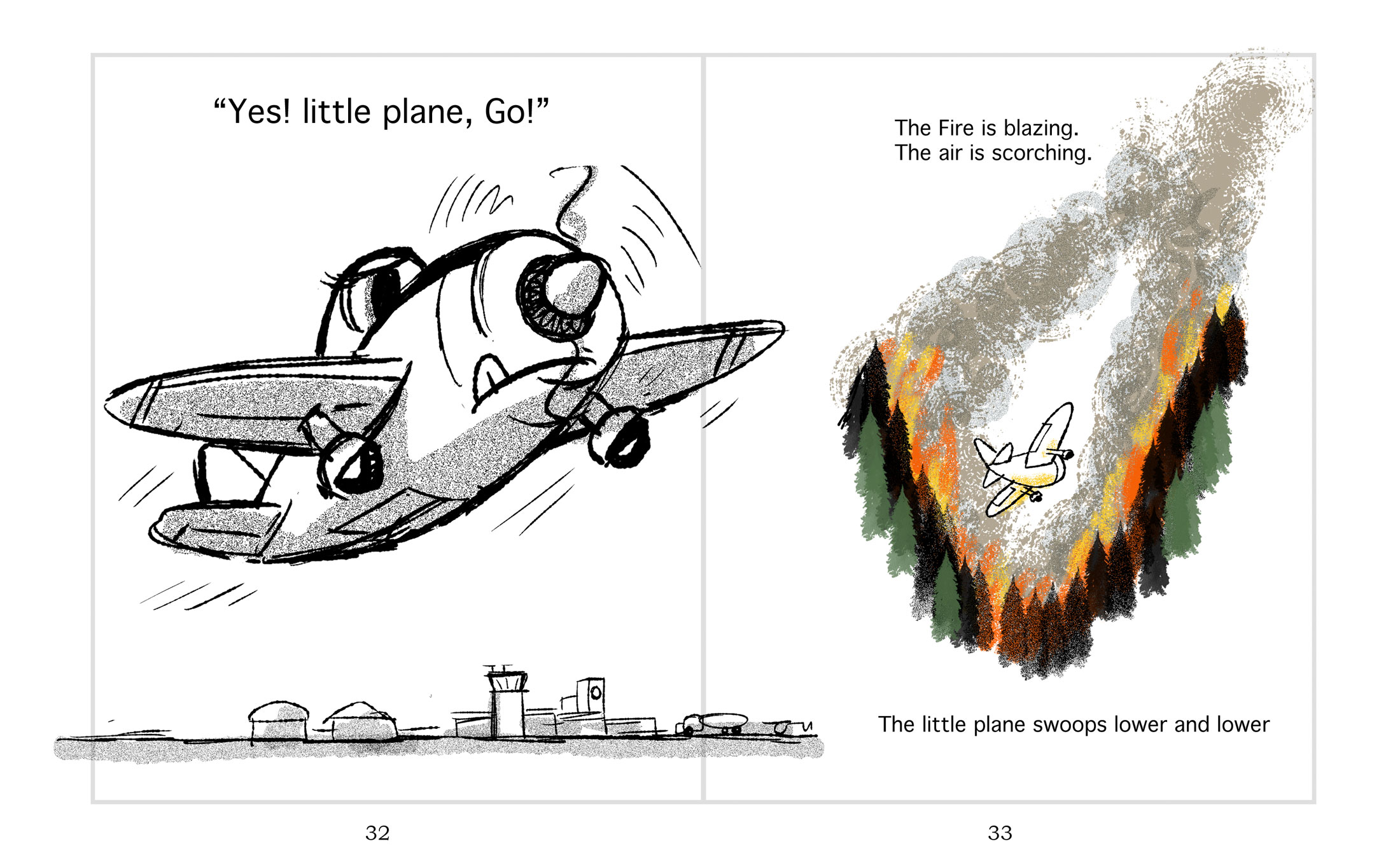
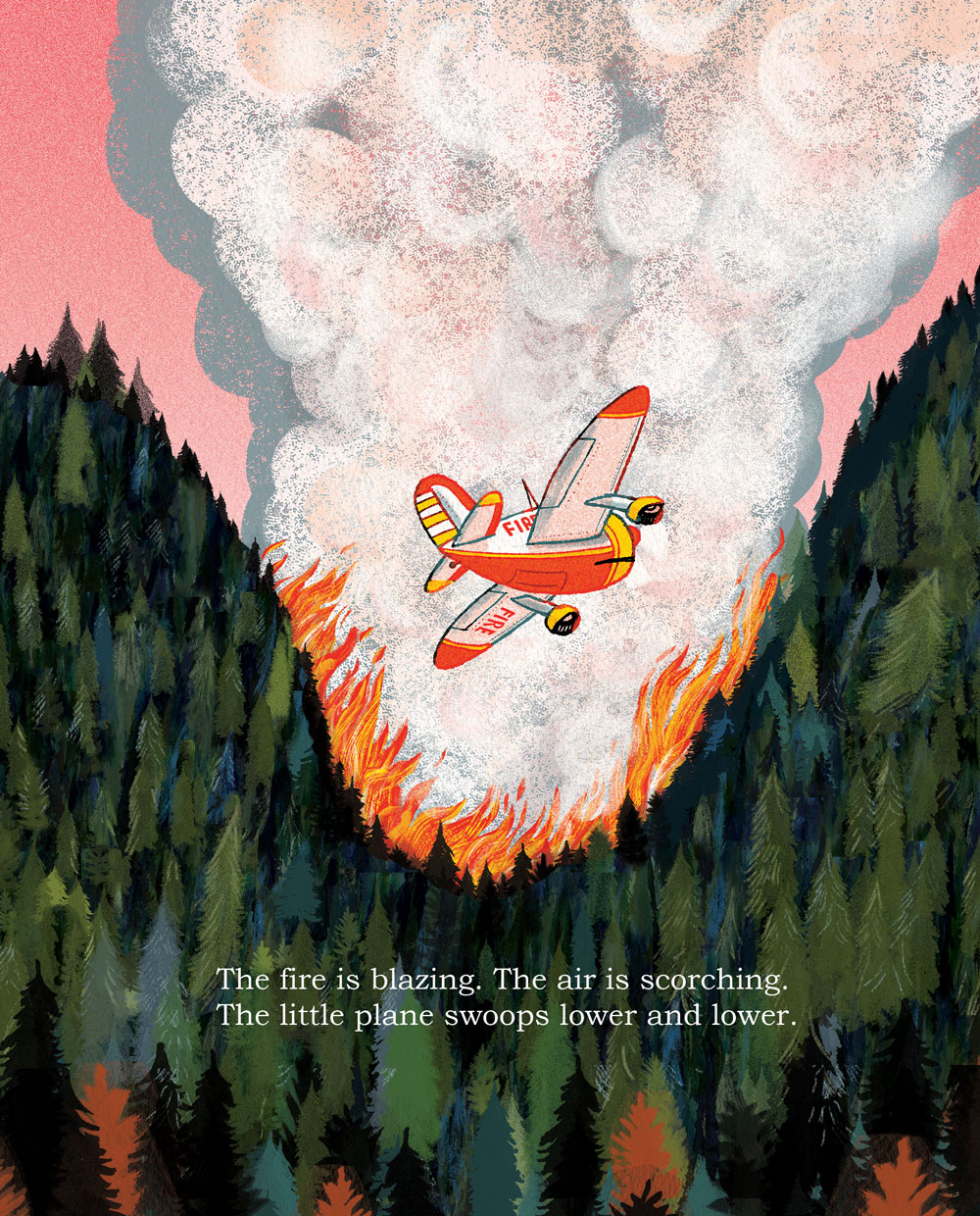
Little Smokey by Robert Neubecker

Little Smokey will be released August 6th 2019…

One of my favorite books as a child and a source of inspiration for Smokey was “The Little Engine That Could.” Like the little engine, Smokey isn’t quite ready to play in the majors. When my kids were little, they always wanted to help- whatever the task- painting a room, planting the garden- and they were told that they were too small. “I know I’m small, but I can help!” was the chorus, and that’s Little Smokeys wish too. And little Smokey gets her day…

I’d like to thank Katherine Harrison, my editor at Knopf for all of her insight into shaping this book- also our designer, Sarah Hokanson, who makes the words and pictures sing. Special thanks to Joe Zimmer, Deputy Director Idaho BLM (retired) and to Christine Schuldheisz, Public Affairs Specialist, United States Forest Service, Fire and Aviation Management; for their expertise and fact checking (airplanes can talk, you know.)

And of course to Linda Pratt, my wonderful agent, who believed in Smoky from the start.

SmokeyCoverSSportfolio.jpeg

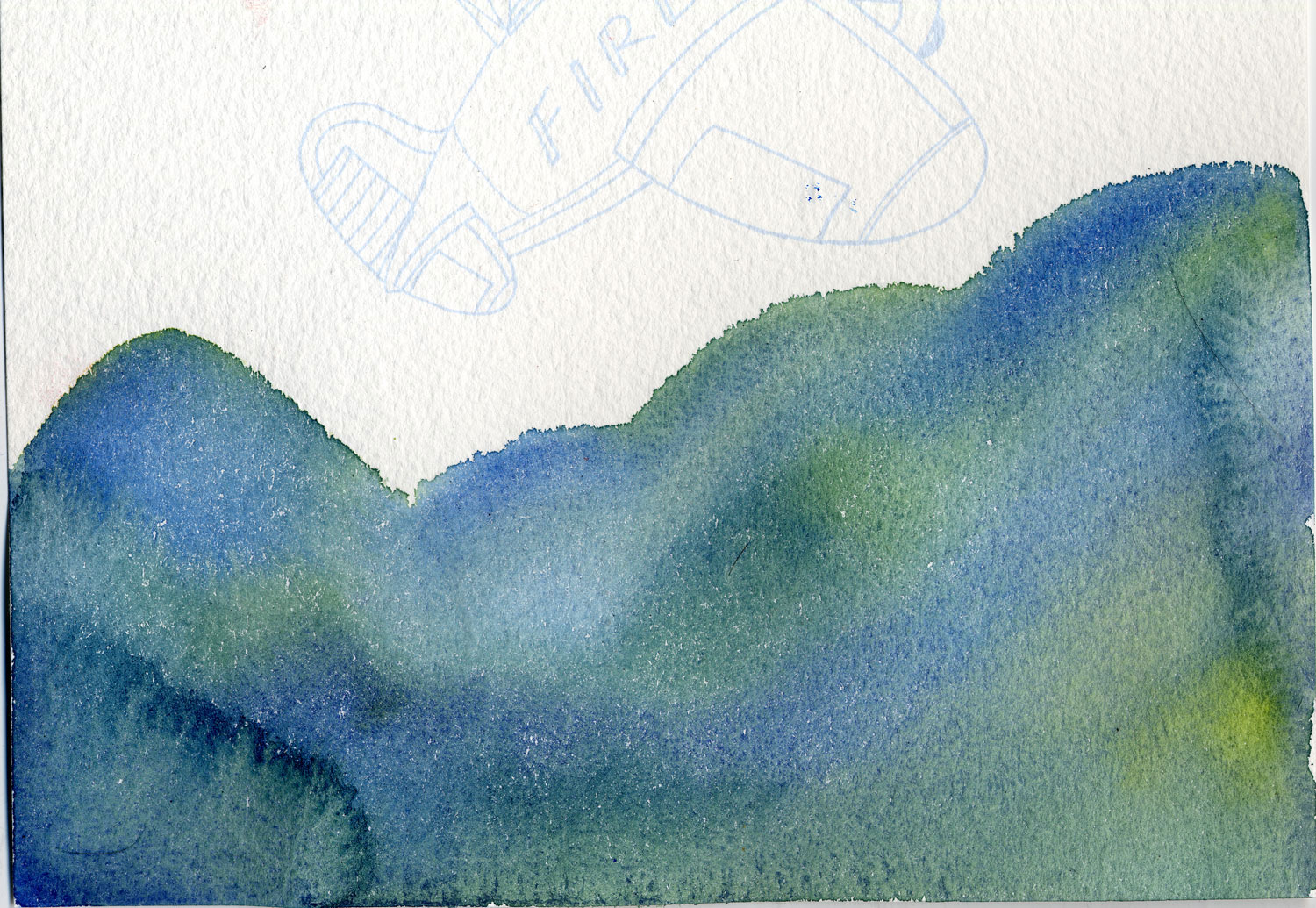
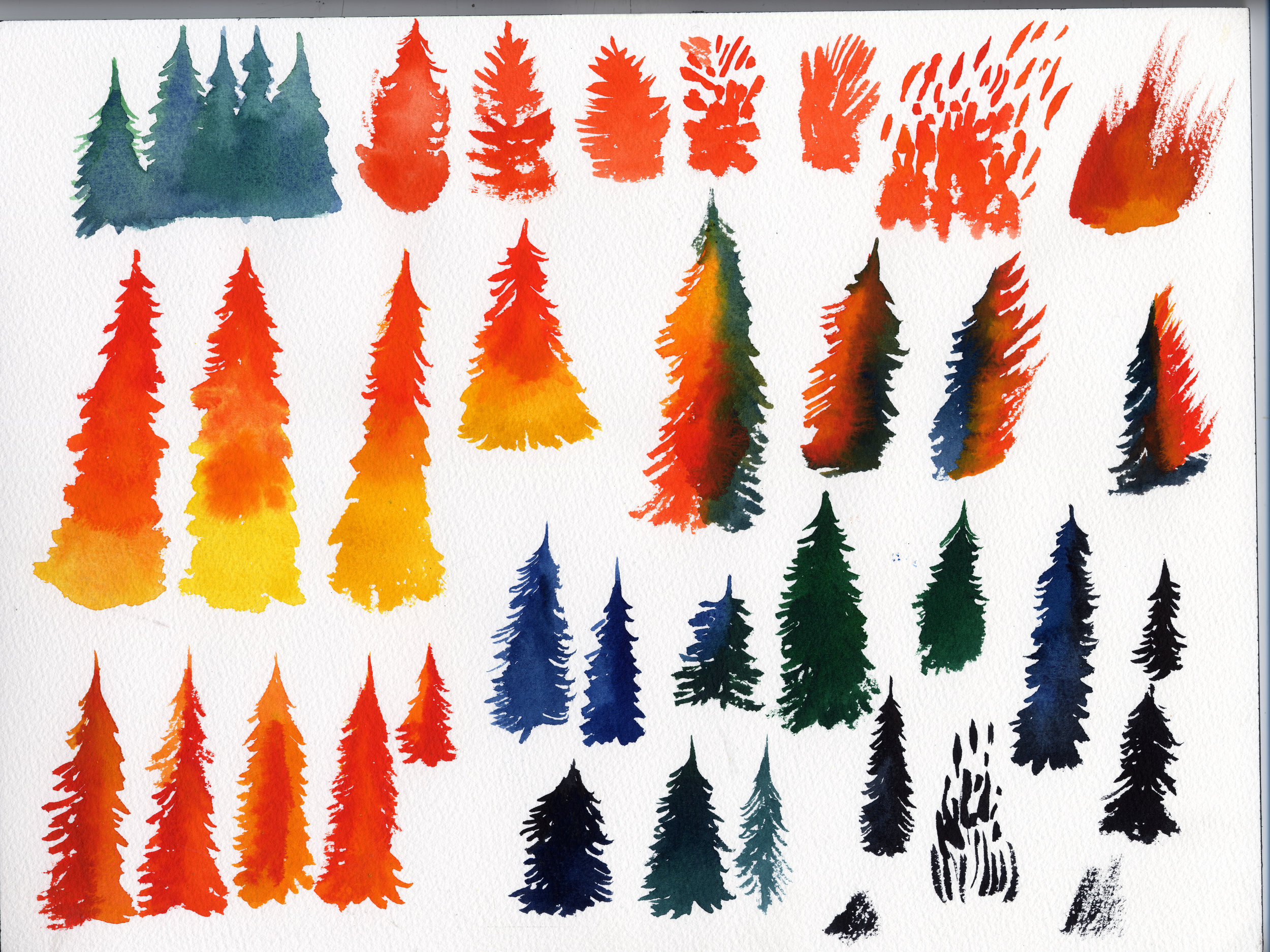
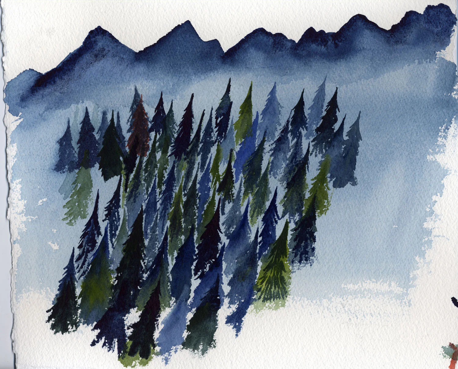
I worked in watercolor most of my life- using it in combination with digital painting gives the art texture, luminosity, and depth. I spent a few weeks on vacation in Vermont and just painted trees- here are a few…

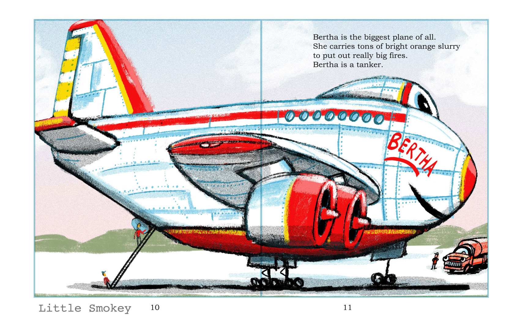
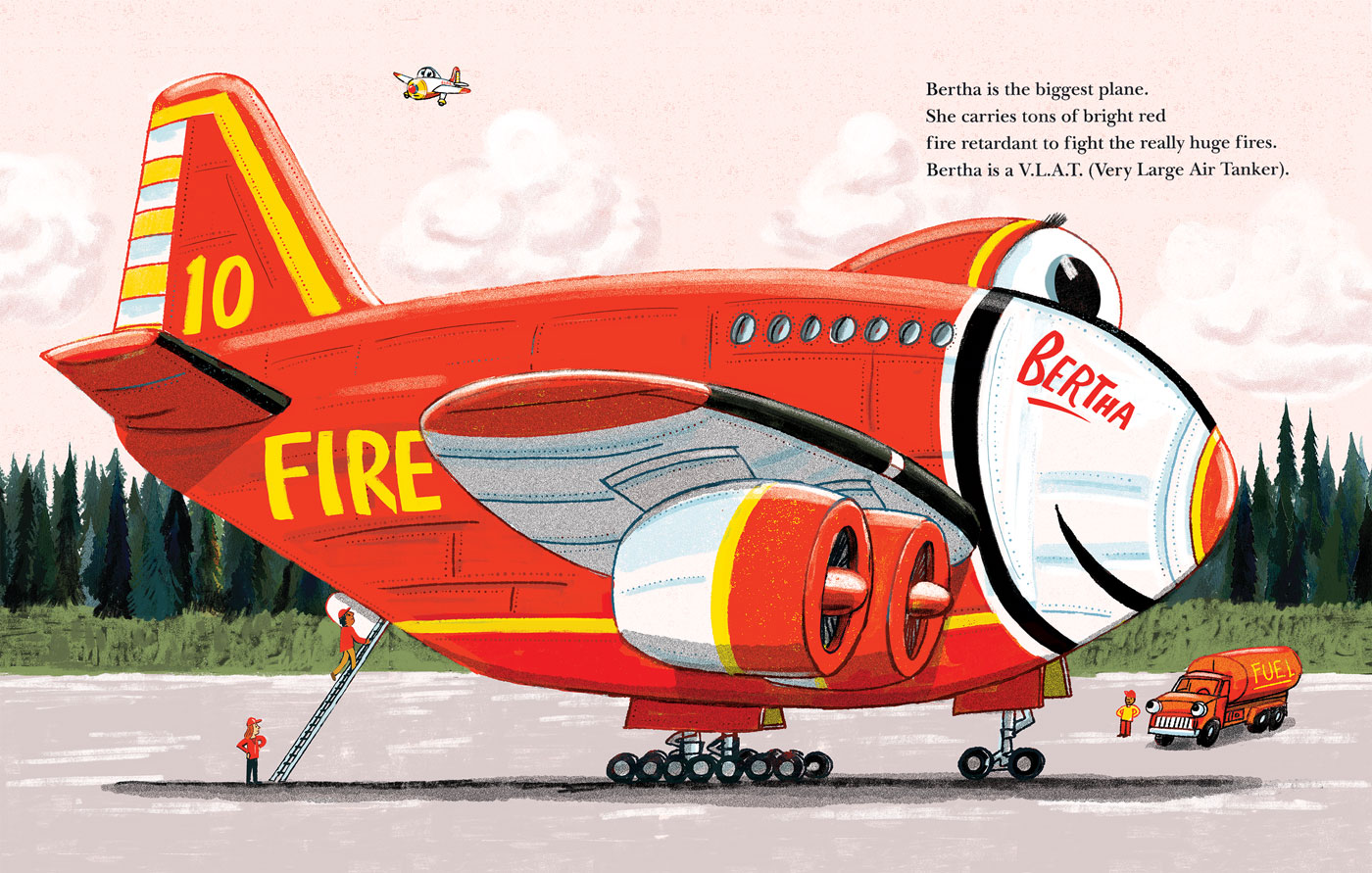
The original Bertha was white/chrome, but I mixed up the colors for better establishing character, and a whole lot of these firefighters are red.

Some scenes from the finished book showing the combo of watercolor and digital.

Some scenes from the finished book showing the combo of watercolor and digital.

Smokey14SStype.jpg
smokey16A-SStype.jpg
smokey16TypeSS.jpg

That’s all for now. The first review is in from Kirkus;

The little spotter plane that could. Channeling old Disney shorts, Neubecker sets his tale among the aerial firefighters of the National Interagency Fire Center. When it comes to forest fires, the water-scooper and air-tanker planes have clearly defined jobs to do. One little plane, who hasn't even "earned her name" yet, yearns to help her companions, but her every attempt is denied. Then one day, a fire starts that can only be reached by someone small, fast, and brave, and the rest is history. The story of a little vehicle that could has been done before, but this book stands apart. Fully half the emergency planes featured are identified as female (including the biggest tanker and the titular heroine). Meanwhile, watercolor, pencil, and computer illustrations create thick evergreens engulfed in swirls of orange and red flames as white and gray smoke permeates the space that is left. So enthralling are these landscape scenes that they feel positively cinematic. Angled views often present the planes with just one eyeball instead of the two that are clearly present when seen face on, but this inconsistency is only mildly unnerving. Copious backmatter discusses how wildfires start, who fights them, who the crews are, what aerial firefighting is, what readers can do, and where readers can go for more wildfire information. This book may look like a classic, but with forest fires ever more frequent and intense, it's truly timely. (Picture book. 3-6)

Salt Lake City Main Library Exhibitions is up! by Robert Neubecker

More Library Show! I couldn’t be happier with having my illustration Show in the Children’s Library in this fabulous building in the center of a metro area of two million. The show runs all summer long. Having a show in such an openly public venue, especially a library, is perfect for this work. I focused on the kids books and hung them at 50” centers so the kids could see them easily. Photographing the show was tough- I used my phone, which was not adequate, but through the magic of photoshop I salvaged the exposure somewhat. I had to shoot them at knee level... I'd like to thank Librarian Robyn Green and Assistant Librarian Tressie Rollins for all their help in making this possible, and for hanging all the pictures- no mean feat.  It's a real honor to be here. This is the hub of urban life in Salt Lake, the center of the city. And, as we open, the Pride Festival is just outside in Washington Park. Utah. Wow.

The editorial wall.

The editorial wall.

checking labels.

checking labels.

Tressie fixing labels on picture book wall.

Tressie fixing labels on picture book wall.

Picture book wall, south.

Picture book wall, south.

Picture book wall, North.

Picture book wall, North.

I showed a few original ink drawings- most of the work is Epson prints; digital color

I showed a few original ink drawings- most of the work is Epson prints; digital color

With Beasty Bath, We showed the whole process from thumbnail dummy, sketches, pencil dummy, watercolor originals, and printed book.

With Beasty Bath, We showed the whole process from thumbnail dummy, sketches, pencil dummy, watercolor originals, and printed book.

Sorry about the exposure, but you get the idea...

Sorry about the exposure, but you get the idea...

Editorial.

Editorial.

Editorial wall. I left out pictures with guns.

Editorial wall. I left out pictures with guns.

Haring book, of course.

Haring book, of course.

Wow! books.

Wow! books.

Linus, the beloved vegetarian T-Rex

Linus, the beloved vegetarian T-Rex

LibraryShowLInusTitle.jpg
LibraryShowLION.jpg
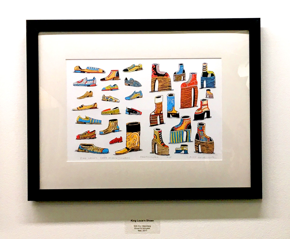
From King Louie's Shoes with David Steinberg.

From King Louie's Shoes with David Steinberg.

90's!

90's!

From Monsters on Machines with Deb Lund.

From Monsters on Machines with Deb Lund.

Of Course. L top-R; Chicago Tribune, Summit County Library Card, Fox Searchlight Pictures, Time Magazine.

Of Course. L top-R; Chicago Tribune, Summit County Library Card, Fox Searchlight Pictures, Time Magazine.

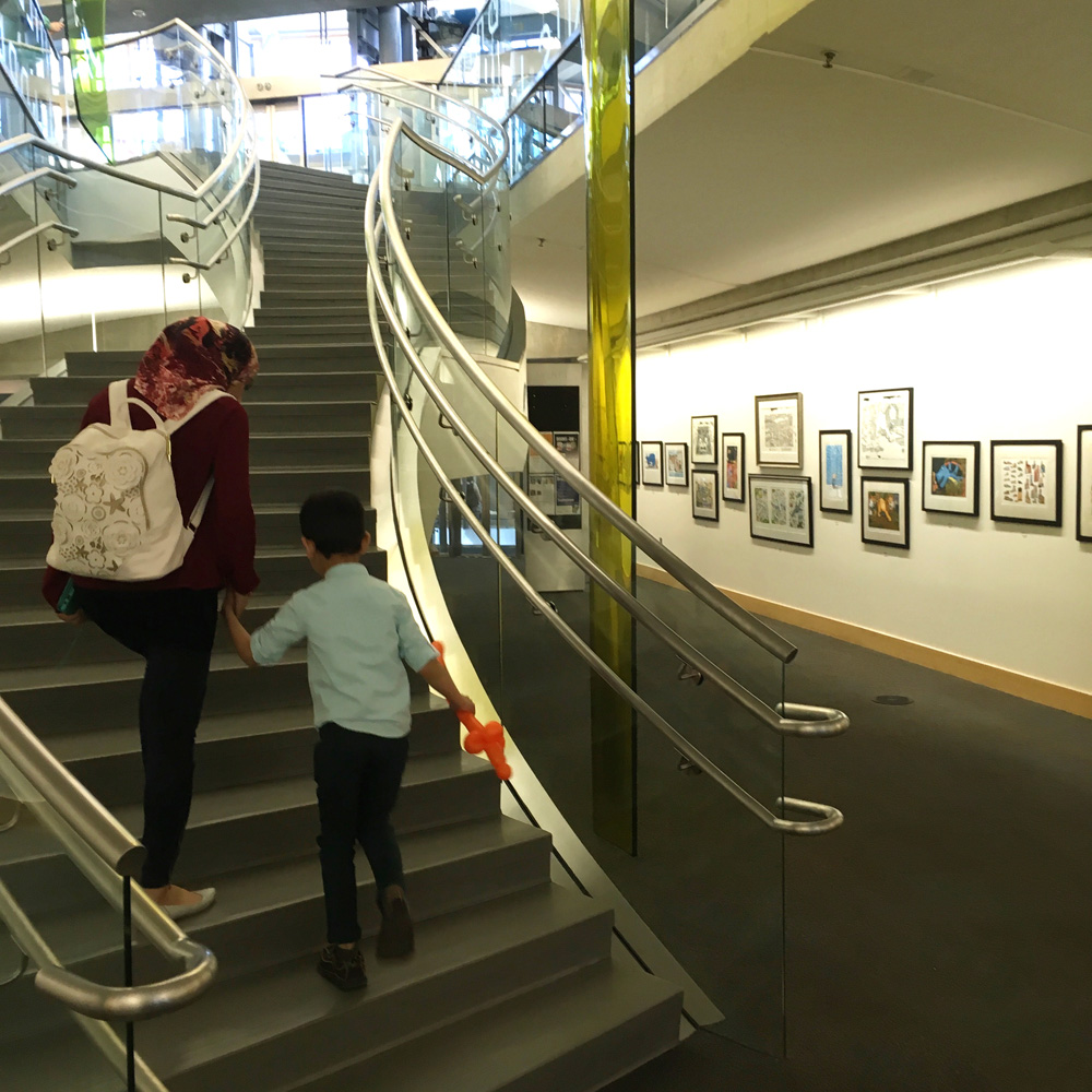
Some shots of the Children's Library lobby and the main library. Nice building.

Some shots of the Children's Library lobby and the main library. Nice building.

LibraryShowGalleryShot.jpg
LibraryShowWATER.jpg
Showl1st.jpg
Library_show1.jpg
Library_Int7.jpg
Glass elevators

Glass elevators

Thank you! Show runs from June 4th to August 18th. Have a great summer!

Thank you! Show runs from June 4th to August 18th. Have a great summer!

Salt Lake City Main Library Exhibit! by Robert Neubecker

One of the most fun parts of my job as an Author/Illustrator is reading to kids in schools and libraries. The Greater Salt Lake Library system sent out a call for artists to hang shows in their many libraries across the Wasatch Front- I sent them a link to my website and here we are- the children's section of the main library in Salt Lake City. It's a remarkable piece of architecture, and a community center for a growing metropolitan area of over two million people. The show will be up all summer, June 4th to mid August. So this is a big thing. I've concentrated on my thirty plus kid's books, but, having been an outspoken editorial illustrator for a lot of years, there's a lot of that too. Robyn Green, the head librarian, said: "Good. It'll make 'em think."

Below are some pictures of the framing process in my studio. My framing is done by Mary Schawb of Avenues Frames- a to the trade framer in our old 19th century neighborhood in Salt Lake. For the show we found some very affordable ready mades from Dick Blick and Mary cut mats- a lot of these are digital and were printed on my Epson 1430 on heavy matt paper.

Interior of the Main Library. We'll be hanging the show today (May 31st) and I'll post another entry with exterior shots and the art in place.

Interior of the Main Library. We'll be hanging the show today (May 31st) and I'll post another entry with exterior shots and the art in place.

The studio, actually, never looked better, so here are lots of pics:

The studio, actually, never looked better, so here are lots of pics:

studio7.jpg

We framed north of sixty illustrations.

Eleanor Early, who'll be starting at SVA in the fall, framing an original. This is a brush & ink drawing that will later have color added on the Mac. I'm including both the drawing and the color print to show the process. Art from "What Little B…

Eleanor Early, who'll be starting at SVA in the fall, framing an original. This is a brush & ink drawing that will later have color added on the Mac. I'm including both the drawing and the color print to show the process. Art from "What Little Boys are Made of" Balzer & Bray, an imprint of Harper Collins, 2012.

Packing: New York Times broadsheet from April '18 to show people what it is we actually do here...

Packing: New York Times broadsheet from April '18 to show people what it is we actually do here...

Sideways poster, three Newsweek cover originals, two L.A. Times Magazine covers, Linus the Vegeterian T-Rex, Wow! Subway! & dartboard.

Sideways poster, three Newsweek cover originals, two L.A. Times Magazine covers, Linus the Vegeterian T-Rex, Wow! Subway! & dartboard.

My son, Izzy, to show the scale. We built the house fifteen years ago in the fashion of the NYC lofts of my younger days (but with heat). Open and airy.

My son, Izzy, to show the scale. We built the house fifteen years ago in the fashion of the NYC lofts of my younger days (but with heat). Open and airy.

We included quite a few originals, brush and ink drawings and a lot of watercolors from the pre- digital era.

We included quite a few originals, brush and ink drawings and a lot of watercolors from the pre- digital era.

Here's George, a Rent-a -Brit who is traveling the Western Hemisphere doing chores in exchange for room & board. He's the son of a friend of Linda Pratt, my literary agent (Wernick & Pratt), and she lent him to me for a week. I couldn't let …

Here's George, a Rent-a -Brit who is traveling the Western Hemisphere doing chores in exchange for room & board. He's the son of a friend of Linda Pratt, my literary agent (Wernick & Pratt), and she lent him to me for a week. I couldn't let him go without seeing Utah's redrock country, so we took a three day camping road trip to Mars. That's another post I'll get to just for fun.

Here's the show announcement. OK. Now we pack up everything and put it up.

Here's the show announcement. OK. Now we pack up everything and put it up.

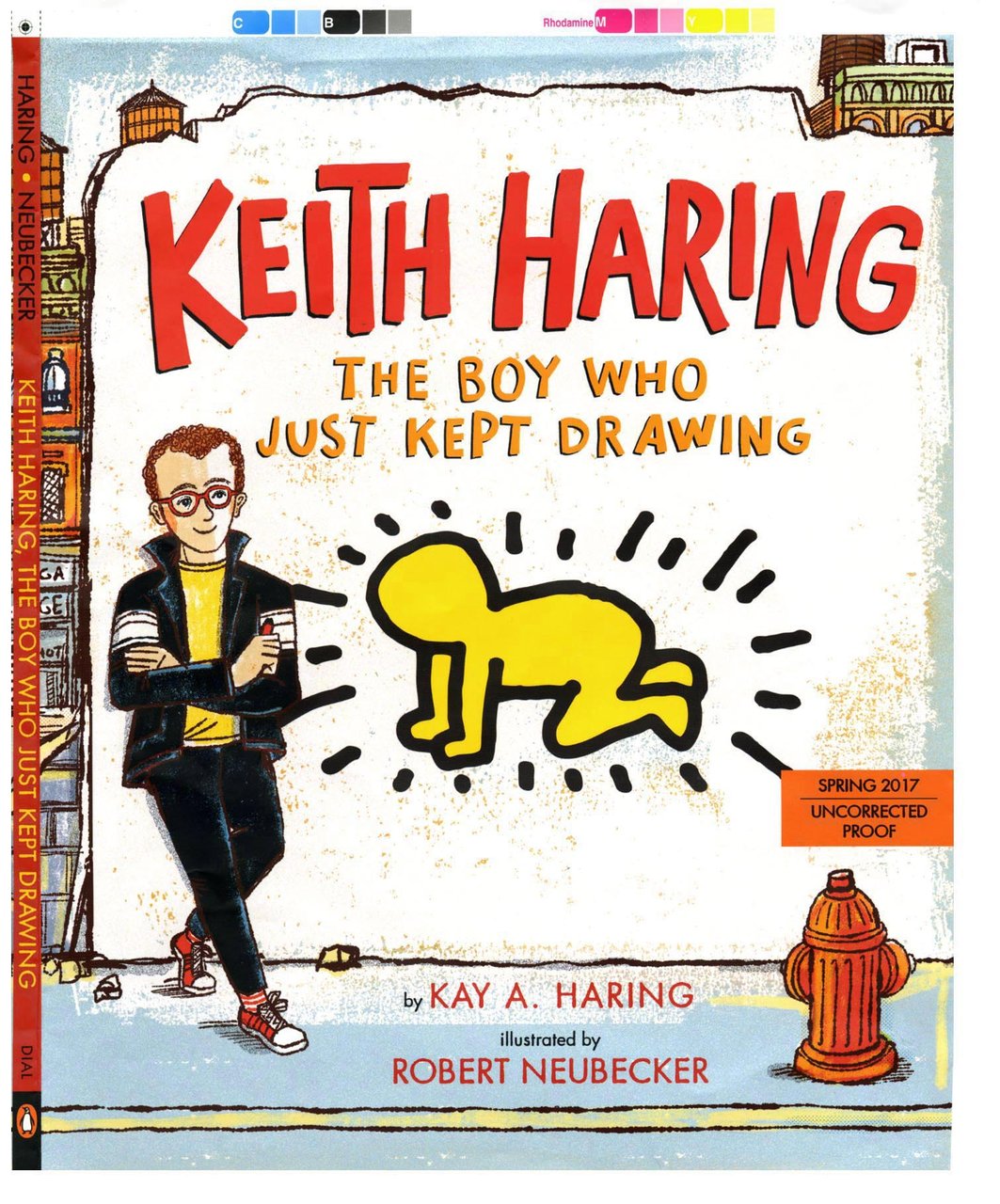
Keith Haring: The Boy Who Just Kept Drawing with Kay Haring by Robert Neubecker

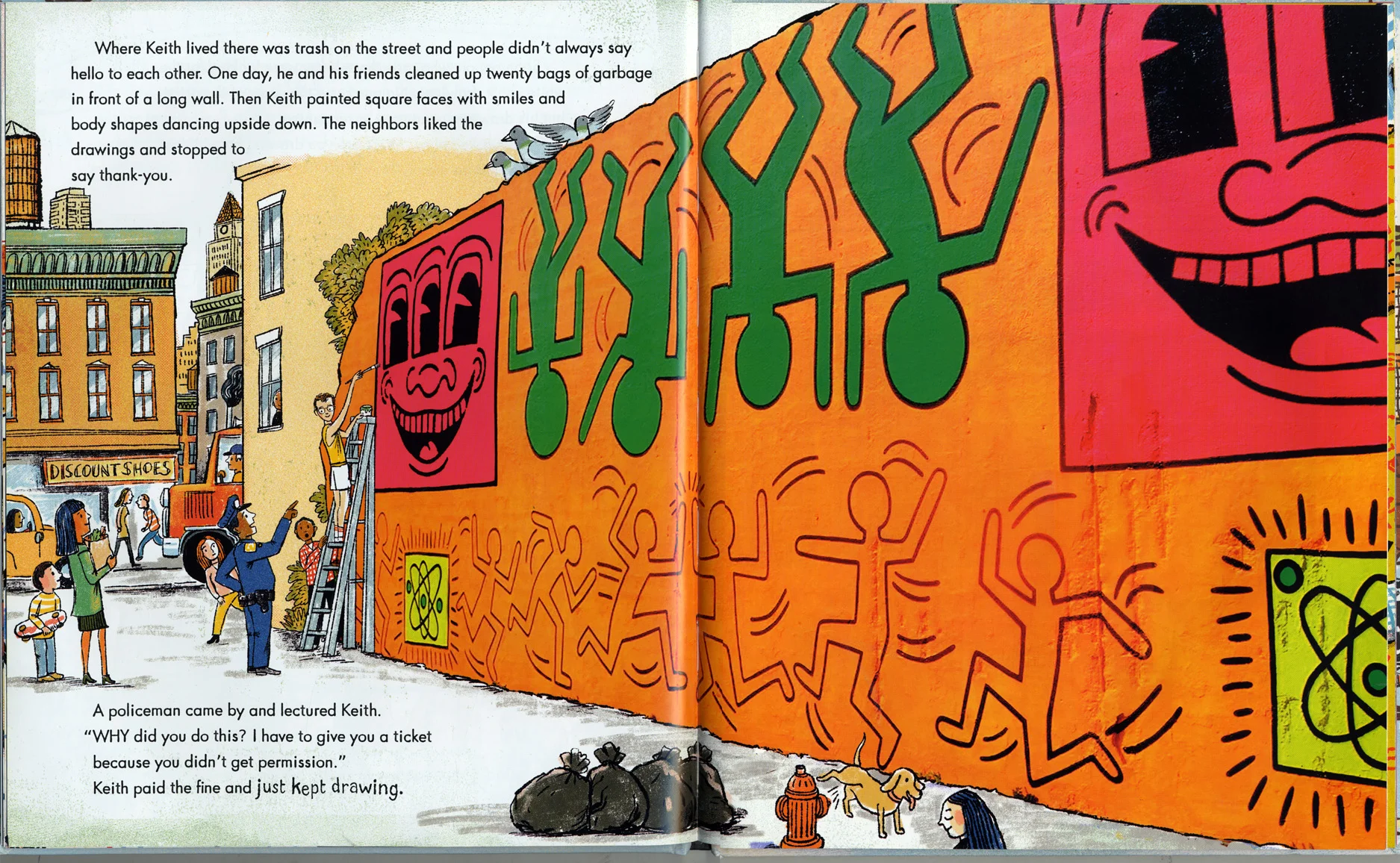
This was an amazing opportunity. It just came in, another commission. The publisher chose me out of all the illustrators on the planet without knowing any of my shared history with Keith and his era. It was pure joy to work with Keith's sister, Kay Haring, and her loving manuscript. We worked closely with the Haring Foundation to showcase Keith's art, under the excellent guidance of Lucia Monfreid, editor, and with the deft art direction of Jasmin Rubero.

The task was to seamlessly combine my illustrations with Keith's drawings and paintings to tell his life story. It was tricky to showcase the art without cropping or retoucing anything. And we did the best we could respecting Keith's work. I got the advance copy last week and it came out magnificently.  Many, Many thanks to Dial Books for making this possible, and to my lovely agent, Linda Pratt.

From Dial Books for Young Readers (Penguin Random House):

This one-of-a-kind book explores the life and art of Keith Haring from his childhood through his meteoric rise to fame. It sheds light on this important artist’s great humanity, his concern for children, and his disregard for the establishment art world. Reproductions of Keith’s signature artwork appear in scenes boldly rendered by Robert Neubecker. This is a story to inspire, and a book for Keith Haring fans of all ages to treasure.

Praise:

“Neubecker’s colorful illustrations capture the energy with which Keith [Haring] lived his life, and cleverly integrate some of the artist’s original works… Always upbeat, this story is a celebration of art and life.” — Booklist

“Neubecker neatly incorporates Haring’s real pieces into these zesty, bustling, digital-and-pencil illustrations…. Haring’s work pops; Neubecker’s compositions and enthusiastic crowd scenes do it wonderful credit.” — Kirkus

“An enlightening look at the merits of street art and how it allows those who may not ordinarily venture into a museum or gallery to experience and enjoy art….Children will relate to young Haring’s drive to pursue his calling despite naysayers.” —School Library Journal

“Cheerily energetic….Schools with “Picture Person” programs, as well as primary grades art teachers, will want to share this appealing title.” —BCCB

About Kay Haring:

Kay Haring is the younger sister of Keith Haring. She is a wife, mother, writer, hiker, lover of art and the wonders of nature. Kay has spent many years both working and volunteering for nonprofits, in management and fundraising capacities.  

Hardcover
Published by Dial Books
Feb 14, 2017 | 40 Pages | 9 x 11 | 5-8 years | ISBN 9780525428190

I would have blown out the chalk drawing more, but it wasn't my call. In the book,it draws you in, and being somewhat faint, adds an intimacy.

I would have blown out the chalk drawing more, but it wasn't my call. In the book,it draws you in, and being somewhat faint, adds an intimacy.

Kay got a Jean- Michael Basquiat crown and I had a Kenny Sharf from my street art collection- I prowled the Village with my Nikon and Kodachrome in the 80's & 90's. I added some of my own stuff on the lamp post from that period, and a couple pic…

Kay got a Jean- Michael Basquiat crown and I had a Kenny Sharf from my street art collection- I prowled the Village with my Nikon and Kodachrome in the 80's & 90's. I added some of my own stuff on the lamp post from that period, and a couple pics of my rocker friend Holly Beth Vincent of Holly & the Italians. A few references to CB's and some tags, and there you go.

This looks better in the book- color's better. We had to work with Kay's photos, in spite of the million dollar budgets that children's books have, we couldn't afford to buy rights to any photo of Keith's murals we wanted. The art was different as t…

This looks better in the book- color's better. We had to work with Kay's photos, in spite of the million dollar budgets that children's books have, we couldn't afford to buy rights to any photo of Keith's murals we wanted. The art was different as the Foundation owns the rights- so I designed around what we had and Jasmin and I restored the shot as best we could. I think it came out great. I once worked with J.C. Suares at Push Pin Press. We were doing a trade paperback called "The Great Disasters". I said to J.C." But J.C., the Hindenburg crash only killed 26 people- the Yellow River floods of the 1920's killed hundreds of thousands..." J.C. replied: "A great disaster is whatever we have great pictures of." Just so.

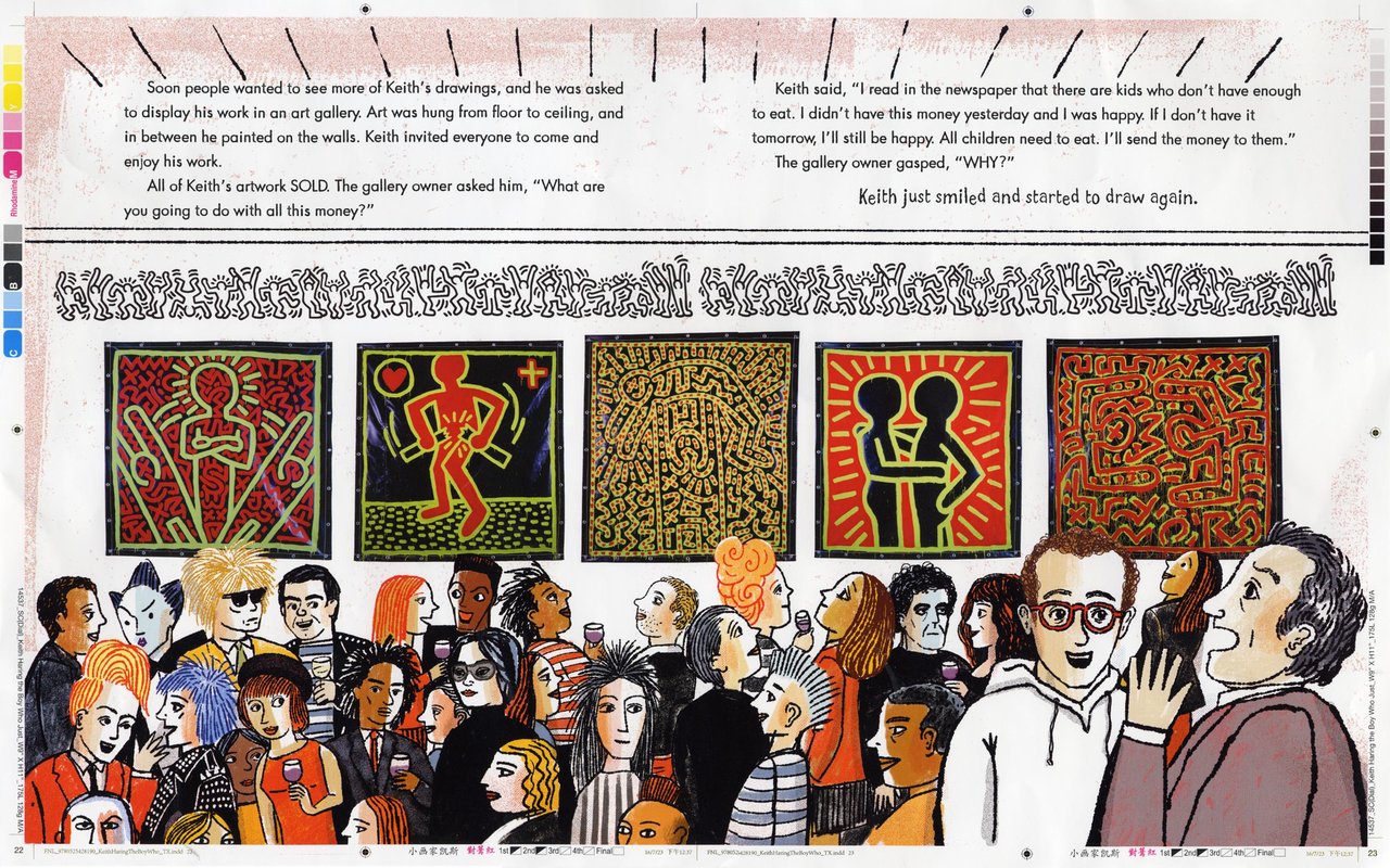
I wasn't at this opening, but everybody heard about it. I added a few people that I like, Klaus Nomi, Ann Magnuson (who I remain desperately in love with-I'll never forget the Lower East Side Ladies Auxiliary from Club '57...) There's Lou Reed and J…

I wasn't at this opening, but everybody heard about it. I added a few people that I like, Klaus Nomi, Ann Magnuson (who I remain desperately in love with-I'll never forget the Lower East Side Ladies Auxiliary from Club '57...) There's Lou Reed and Jeni Muldaur, his bandmate. There's John Sex, Basquiat, Yoko, Grace Jones, and next to Andy, my dear friend Ronnie Cutrone, who worked as Andy's assistant for ten years and died too young. I kinda had to draw Shafrazi, Keith's dealer, although I never forgave him for vandalizing Guernica. Yeah, that Guernica.

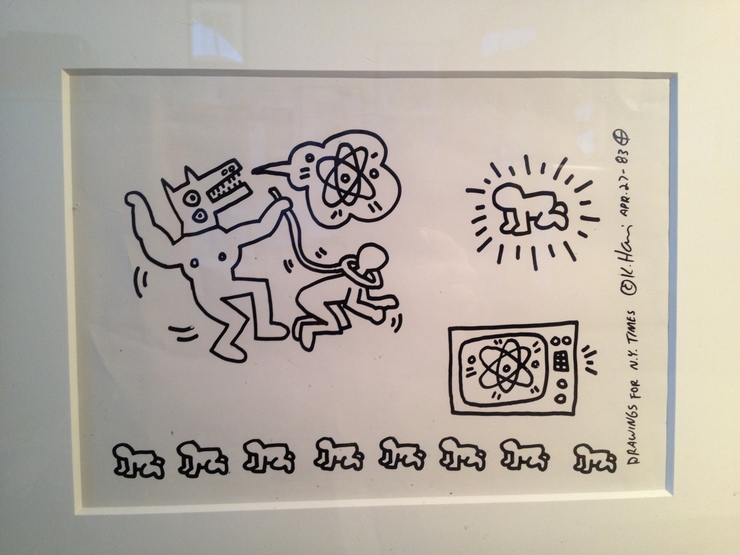
This is one of my Haring stats (as in photostat) When I was a kid working at the New York Times, the grownups were all on vacation, and another kid, Lisa Powers, had the art direction of the Op-Ed page for a week. A piece on The Three Mile Island Nu…

This is one of my Haring stats (as in photostat) When I was a kid working at the New York Times, the grownups were all on vacation, and another kid, Lisa Powers, had the art direction of the Op-Ed page for a week. A piece on The Three Mile Island Nuclear Disaster came across her desk and I wanted to call Andy Warhol to illustrate it (hey, why not? it is the Times...) She called Keith instead. He came up with a beautiful set of nuclear themed drawings- something that he was very concerned about. At the Times, photostats were made and the originals returned. Later, the stats were discarded. I kept them. I shared these with the foundation, and the originals, sadly, are lost. I never knew Keith, but I saw him often, and in doing this book, I am absolutely amazed at the quality, breadth and depth of his output in only ten short years. What a treasure he left the world, I hope this book will introduce a whole new audience to it. That's it. I'll get in trouble with the publishers for posting too many spreads, but this is "to the trade", so there. The book comes out Valentine's Day, as a tribute to Keith (Kay's idea).

Robert Neubecker, Park City

Slate by Robert Neubecker

7477352350.jpg


Slate was founded by Bill Gates at Microsoft in the mid nineties. Gates wanted to prove that a first rate newsmagazine could exist solely on the Internet with no print equivalent.

    His first step was to hire Michael Kinsley as our editor- in- chief. Mike had been editor of The New Republic and is best known for his run on CNN’s crossfire opposite Pat Buchanan. Mike assembled an outstanding staff from The New Republic, the Washington Post and jeez, half the Harvard alumni that I’d have to do actual research to list. The following tale is how I remember it unfolding in the spring and summer of 1996:  

Patricia Bradbury was the art director who started it all so I’ll just quote her:

“In 1995 I was hired by Microsoft to go to work on MSN, the fledgling online news service. I'd gotten Newsweek Online up and running, so I was hired to work as a contractor on MSN. After close to 9 years at Newsweek, and 20 years in NYC, I was ready for a change, to head back to Seattle where my family still lived, and lots of friends still lived, and to work on something entirely different.
    I was working in my office, and one day this guy moved in across the hall from me who looked very familiar, but I wasn't quite sure who he was. After some phone calls to Mickey Kaus, I found out it was indeed the famous Michael Kinsley, and that he was starting an online magazine for Microsoft. I immediately went in to ask Michael if I could work on it with him. I proposed that I help get the thing going, along with some other Microsoft art directors and designers. They had me gather a group of illustrators to choose from, and knowing how great and how fast your work was, I pitched you, Mark Stamaty, and Philip Burke as prime illustrators for Slate. I don't remember why Philip didn't get a contract, but I was really happy that you and Mark got to work on Slate. I was a believer, but I really wanted them to not be idiots, and to do it right. They did.”

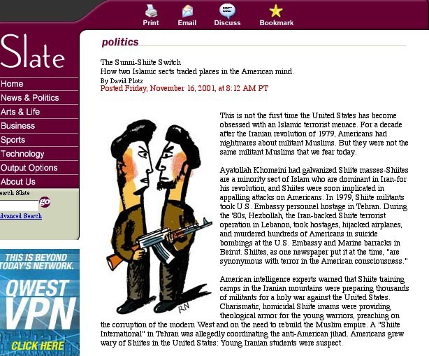
     Meanwhile, I,  (Neubecker) was working in watercolor and pen, but I’d been experimenting with bare bones brush and ink drawings as a personal project. Living in lower Manhattan, I hung around with some of the political artists from COLAB like Becky Howland and Kiki Smith. I got interested in exploring the relationship between political cartooning, illustration, and political art. I started by stripping drawing down to it’s most basic elements, using fat, ruined brushes on watercolor paper and then illustrating a single concept or idea. I collected overheard phrases, song lyrics and headlines and drew them, then hung them together in big batches.  I showed some of these in the East Village with Gracie Mansion.

    Patricia bought a few of these drawings and, when they were developing a look for Slate, showed them to Mike and the Slate editors. The idea was to use simple black and white drawings that could download quickly on the old, slow, dial up modems. I had newspaper experience, and had worked extensively with Patricia when she was design director at Newsweek, so she knew that I could produce on short deadlines. So far so good. But, then the Microsoft people suggested, why couldn’t we just hire a high school kid who could draw, pay him peanuts, and come up with our own cartoons? (ain’t that cute?)

   Patricia went to bat for me then and all summer long. First, I said, go ahead and get the kid. I’ll work for two weeks, and if you like the kid better, hire him and you don’t have to pay me. The kid disappeared. She then hired Mark Alan Stammaty and myself as Slate’s first illustrators, in the spring of 96.

I’ll quote Patricia again: “The great thing was that finally I got Microsoft and MK to agree that the kid just wasn't up to it, and that they did need someone like you and Mark to help give Slate the look it needed to have to be taken seriously.” And I’ll add; wow, they coulda’ had Burke too?

    The next hurdle was the contract. It was about what you’d expect from Microsoft, without the stock options. I based my fees on The Wall Street Journal because there were no comparables at the time. I worked all summer without a contract or a paycheck while Patricia patiently, persistently moved the contract from WFH to the normal one time usage, artist copyright, that is the ethical norm. I got a Microsoft shirt in June and the big joke around the studio was that that was my pay… but I believed completely in the project and was willing to show up on faith that Patricia would work it out. And she did. We ended up with a contract for two drawings a week, and I’ve done it ever since, wow, fourteen years and counting.

   I worked with Ian Adelman on the day to day illustrations for a few years. I did the drawings big, xeroxed them, and faxed them. We liked the graininess. Ian went out on his own and was replaced by Kathleen Kincaid as AD and Lori Johnson as assistant. Over this period, the technology improved, and I began scanning and e-mailing artwork. I put in for a raise and Kathleen said, “Sure, but can you work in color?” well, of course. The website continued to improve with technology, becoming more interactive with live links all over the cover. This really junked it up, to my horror, but I’ve gotten used to it now. In the old days it had a very elegant, spare cover…, that I’ll try to find a screen grab of if I can only find a zip drive…

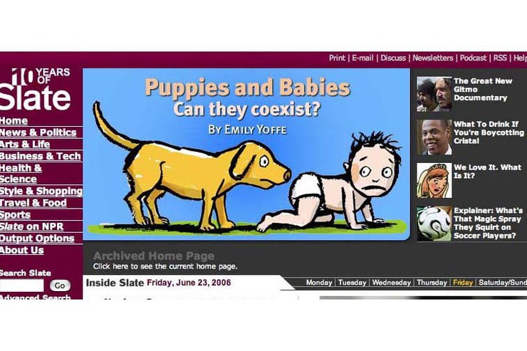
  Microsoft sold Slate to the Washington Post in 2005 and the offices moved to New York. I miss the thoughtful retreats that Microsoft used to throw for the staff at Cascade Mountain resorts… It was great meeting everyone that I have worked with- something illustrators rarely do today. I was pretty tongue tied around Mike Kinsley but I’m used to reporters and I nearly drowned our Supreme Court correspondent, Dalia Lithwick , on the rafting trip. She went after me with a super soaker and I retaliated with a bilge pump. On another retreat, I was driving a rental car with contributors Robert Wright, Emily Yoffe, her husband John of the Washington Post and their seven year old daughter. The conversation was so interesting that I missed the turn to the mountains, drove on for hours, and ended up in Canada.

   It is such a pleasure to work with these people. Mike stepped down in 2002 when Jacob Weisberg took over as editor. Jake is best known (among us low brows) as the originator of the “Bushism” series ofW.’s linguistic atrocities. It runs many volumes.

   Slate has continued to evolve, adding Nina Frankel and Charlie Powell to the regular illustrators, and Rob Donnelly doing animation. Other illustrators contribute as well.

   One of the big questions we all have as illustrators are where will we be in ten years? I see more and more illustration being used on the web. There was an explosion of illustration being used online in ’99 and ’00 before the tech bubble burst. This is gradually coming back and with the advent of the I-Pad and similar devices I expect this to open up more. Long columns of grey type is always boring- even in the New Yorker, bless them. Photos all look alike after a while. I have two web illustration jobs on now, series of drawings.  One of the nicest jobs I did last year was a web animation I did for a pharma company. I teamed up with Rob Donnally from Slate who made the drawings move. I expect to see much more of that as time goes on. And print, like radio, I don’t think will ever go away. They say video killed the radio star. Tell that to Howard Stern.
Texaco makes it an institutional policy to discriminate against people of color. This is 1997 or so...

Texaco makes it an institutional policy to discriminate against people of color. This is 1997 or so...

Environment

Environment

The usual bullshit....1996


The usual bullshit....1996

September 2001


September 2001

I'm not sure what this was for....


I'm not sure what this was for....

Laid off-


Laid off-

Killing abortion doctors... 2002

Killing abortion doctors... 2002

Another election

Another election

Getting into New York private pre school...2004 or so...

Getting into New York private pre school...2004 or so...

Like it says. I donated this image to a transsexual support organization in Germany to use as their logo....early 2000's


Like it says. I donated this image to a transsexual support organization in Germany to use as their logo....early 2000's

This was after a fvorite Andre Francios drawing, 1965


This was after a fvorite Andre Francios drawing, 1965

Here's some recent stuff...

Here's some recent stuff...

Today!

Today!

0694651872.jpg
9879317699.jpg
5856757672.jpg
Emily Yoffe as "The Human Guinea Pig" volunteers to be a practice patient for clueless medical students...2007


Emily Yoffe as "The Human Guinea Pig" volunteers to be a practice patient for clueless medical students...2007

Cloning Hitler: Not what you might expect

Sideways Story by Robert Neubecker

1SIDEWAYS1.jpg

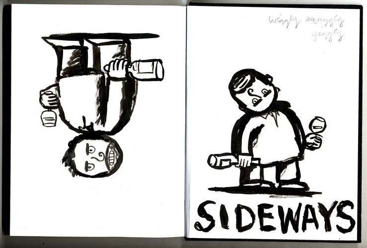
     I've won a lot of awards for the Sideways poster, AI, Society of Illustrators, and the Key Award- poster design's Oscar- for best comedy poster. There's a story behind the making of this. The funniest part is that they used one of my sketches for the final art. I had no idea until I saw it. When the job came in from Stephanie Allen at Fox Searchlight, I was delighted, of course, and determined to land this one for illustrators everywhere. It's been a long time since we've seen illustrated movie posters like this -  I am referring to the simple graphic posters of the late 50's and sixties by people like Tommy Ungerer and Saul Bass. So I did dozens of sketches. The director, Alexander Payne, had seen a cover that I'd done for the L.A. Times Magazine about alienation in Southern California and wanted to capture the same feeling of anger and malaise. It did help that I had Paul Giomatti as the star.I did a half assed likeness of Paul just so they got the idea, and then did every combination of two drunks, two women, and booze that I could think of- in the three or four days I had. I heard nothing for two weeks- then I got the call that the poster was done. I tried to argue, but Stephanie said it's printed...  so I said send it over. Anyway, turns out that they liked the freshness of the sketch. I would have tightened up the likenesses- but it's always a battle in drawing to maintain that perfect balance between energy and accuracy. I have had art directors just use the sketch before, to great effect.  

 Christian Struzen, my designer, turned the bottle on it's side, added the green texture, and of course did the type. Sideways came out in the fall of 2004. I've done three other movie posters since, one for the movie "Cyrus" with Marisa Tomei and John C. Reiley, one with Phillip Seymour Hoffman, and one with Halle Berry. The suits went with photos.


2607291174.jpg
Sideways.O.5(OH).jpg
8493509143.jpg
sideways 5r.jpg
Sideways.O.4.jpg
sideways 9.jpg
2198411269.jpg
6296694338.jpg
0584308238.jpg
6679410793.jpg
The winning sketch.

The winning sketch.

This is the L.A. Times Magazine cover that inspired the producers of Sideways to commission the poster.

This is the L.A. Times Magazine cover that inspired the producers of Sideways to commission the poster.